PLAY-DOH WORLD MOBILE APP
For the Play-Doh World app, I created the whole concept art of the project to stimulate children’s imagination and to be whimsical, based on the game design and Hasbro Play-Doh brand requirements. I brought the concept of a tree house, which would be shown from the outside to the inside of the tree, where the player would access all the games.
-
I was responsible for creating all the UI Icons for the whole app, based on children's developmental stages and accessibility requirements.
-
I defined and created the whole Play-Doh World App art style. It resembles how children draw (multiple perspectives) and a subtle texture was applied to connect the art style to the real Play-Doh compound.
-
Throughout the app, I developed creative and outside the box concept animations.
-
When designing the user experience for the Play-Doh app, with my knowledge in childhood development and a deeper user research, I provided solutions that would address not only interaction needs (including accessibility) but also business requirements.
-
Created and defined visual rules to be consistent with the Hasbro brand requirements and guidelines. I also made sure that all art and design documentation was up to date.
-
With my rigorous quality assurance practices and keen eye for details, I worked closely with the Tech and QA teams, providing guidelines and performing the visual quality assurance for the whole Play-Doh World App.
-
Responsible for defining design systems to be followed by the whole team, including documentation systems, asset naming conventions, asset management and flows and standards in Figma.
-
Designing with Accessibility in mind was a big part of my work, making sure that points from WCAG and other guidelines were applied to the visual parts of the app, without impacting the experience of the game and adding extra costs to the business.

Inside view of the tree house (the hub). The main idea was the exploration of the hub from all the angles of the screen. All the interactive icons in the hub have vibrant colours. Game icons are placed around the tree.

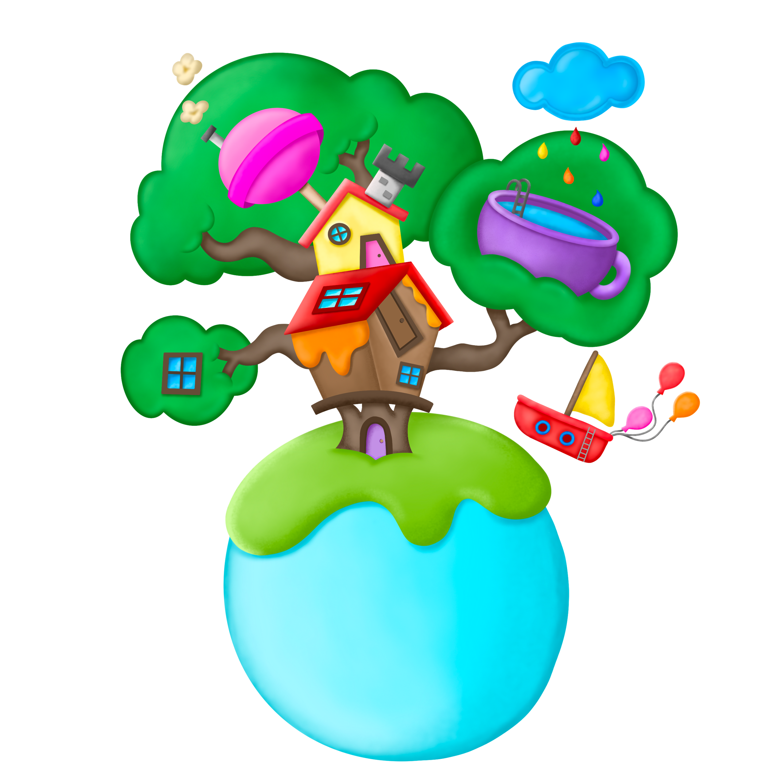
Tree House Outside View
I created a texture that would resemble the Play-Doh compound, as all the elements were made by kids using the Play-Doh tools and their own hands. The outside view was created to change based on business requirements and to adapt to holidays.
UI Design | Concept Art | Concept Animation
Game Icons
Taking in consideration the developmental stage of the players, accessibility and brand requirements, the icons for the games and hubs were created to be whimsical, vibrant, outside the box, and connected to the game play and real life children’s experiences.

Fun Factory game icon concept art


Fun Factory game icon final assets
Fun Factory game icon concept animation. The animation plays every time that the player interacts with the icon.
Pizza game icon concept animation


Fun Factory game icon final animation. I guided the junior animator during the process of creating this final animation and implementation in Unity.

Pizza game icon concept art

Pizza game icon final animation in Unity
Locked Game Icon (for the games that are not available yet). The colour changes based on the location of the box around of the tree, in the hub, for accessibility requirements. The cardboard box represents how kids love to play with boxes and decorate them with stickers. The stickers are coordinated with to the theme of the games.
Unboxing Icon. When a game is released, the grey box icon will turn to the unboxing icon, which the cardboard box will become colourful and it will be slightly open, showing part of the final game icon. It resembles hide and seek that kids play.
Pizza game icon final asset
Locked icon final animation showing interaction (tapping on the box)
Unboxing icon final animation

Unboxing icon concept animation (sketch)
The Video Hub
This hub included the video tutorials, which were separated by theme. The concept art was created to resemble a blanket fort, to connect with kids' type of play. The icon is presented on the top part of the tree trunk in the Play Hub.

Video Hub Icon


View inside of the Video Hub. The idea is to have the default screen as the lights inside of the fort were on and then when the child selected a specific theme, the lights go off and spot lights go on from the Play-Doh cans and they project images from the theme selected. The video begins from the middle of the pillow and zoom in to full screen.

UX Design
Play Hub
The UX Design concept for the Play Hub was to create large icons (young kids don’t have their fine motor skills developed yet) and to have the possibility to include multiple games. The solution that I provided was the infinite scrolling around of the tree trunk, with the game icons positioned on top of a carpet (to bring the focus point of the screen to the center). The colour palettes were created to have muted and limited colours for all non-interactive assets and vibrant colours to all the interactive icons, making it easier to children to identify which icons are available. All the dimensions were calculated taking in consideration the interaction, the developmental stage of the user, accessibility and responsiveness.

Position of the icons around of the tree.
Infinite Scrolling


Simplified version of Play Hub flow in Figma (detailed flow is not shared)
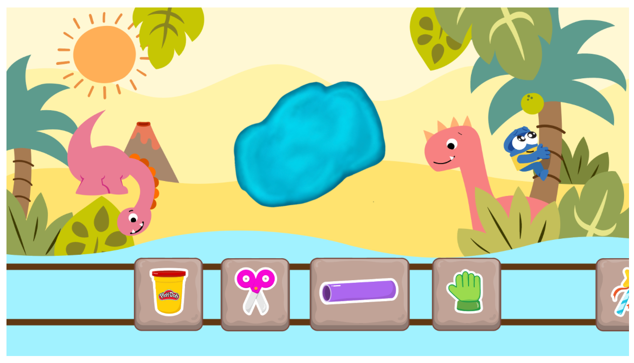
Fun Factory
For the Fun Factory game, the design solution that I provided was to create a menu that resembles a cutting board, simulating what kids use to play with the Play-Doh. The user would tap or drag the trays to move and select the tool icons (some effects were used to make sure that the users knew how to use the menu. It was approved during the play testing). The players could also choose different backgrounds for inspiration and engagement.

Player needed to tap or drag trays to the left or to the right to access all the tool icons.

After selecting any of the main tools, an expanded tray appeared with multiple options and the selected icon would have a green stroke + checkmark icon (image on the right is just to show the simulation of the compound after the heart cookie cutter was applied (it is not the final effect).

Fun Factory Tool Icons (default and selected modes)
Multiple backgrounds were created to engage and to promote imagination, based on different developmental stages.


Video Hub
The Video Hub has the user experience and visuals consistent with the games, to reduce the cognitive loading.

After selecting the dinosaur theme, the scene turned to a “dark room” mode with flashlights and dino theme, and the selected icons had a green stroke + checkmarks.
Brand Guidelines
Play-Doh World Style Guide
Below is part of the style guide that I created for the PDW app, to document the design, art and animation processes, and to guide artists, animators, developers and QA. Note that the whole style guide was not shared and the dimensions were hidden.


Issues were also documented, as part of the guidelines for the Tech team.


The full content of the style guide, which I am showing some parts above.
Technical Art | Accessibility
Visual aspects connected to tech implementations were one of my main responsibilities. Guidelines were created to define software and devices settings for visual consistency, as well as requirements for accessibility.
Below, the image of the digital Play-Doh compound, with the textures and deformations, created by me (on Procreate and Photoshop), and used by the Tech team to make the compound in Unity.
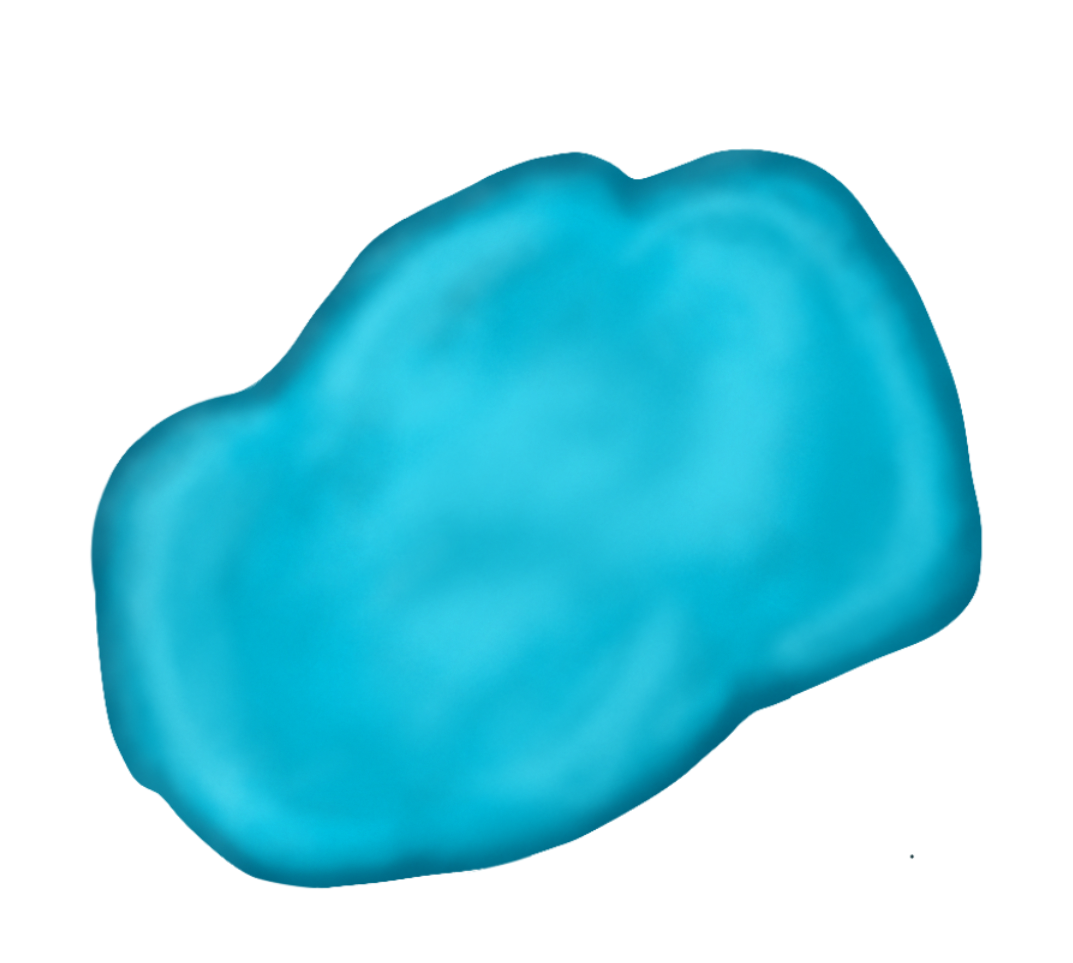


To address accessibility requirements, I defined an exclusive colour palette for the compounds, so when it was placed on top of any background, it would have the right contrast to allow the players to visualize and play with it.