
LEARN WITH PEPPA (LWP) MOBILE APP
LWP app is an educational game, which I had the opportunity to apply my knowledge in design and early childhood development. My work for the Learn with Peppa Pig app was to create the hub and game screens, based on the game design and content requirements, using the same visual elements as the Peppa Pig show.
-
I was responsible to define and create the UI for the games and hubs, based on Hasbro brand guidelines.
-
I defined sets of rules to be follow by everyone involved in developing the app. Worked on detailed and clear documentation to support the work and teams.
-
The UX Design for LWP had the focus on how children play and what visuals could be added that would promote the learning experience and improve the interaction with the game, taking in consideration aspects like developmental stage of the users, accessibility, responsiveness and optimization of the app.
-
I defined animations for the game play connected to the designs.
-
Making sure that all the flows, asset naming, documentation, asset storage and handovers had a clear and easy standard.
-
I ensured that all the designs and animations were created with accessibility requirements in mind.

The hub (icons with white strokes are the interactive stations that give access to the game icons).
All the spaces between icons and assets were calculated based on accessibility, responsiveness and developmental stages of the players, acknowledging their level of motor skills.
UI Design | Brand Guidelines
Game Icons and Hub Pop up Window
These icons would provide access to the games. All the dimensions were calculated based on interaction, safe areas, touch areas, and the developmental stage of the users.

Image above shows the pop up window with three game icons, which one is locked.


These icons would provide access to the games. All the dimensions were calculated based on interaction, safe areas, touch areas, and the developmental stage of the users.
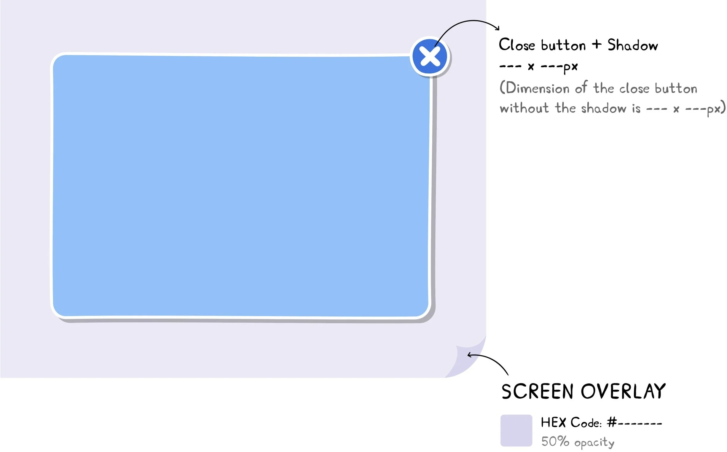

Each pop up window was connected to a specific station (with different games).

UI buttons followed the Peppa Pig brand guidelines, while dimensions and colours were defined based on accessibility.
UX Design | Concept Animation
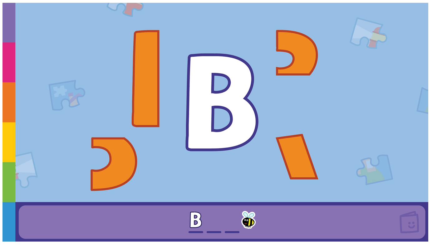
Game 1
User needed to draw the letters through a stencil. Tool icons (chalk and marker) were moving up and highlighted after the players tapped on it (the colour choices for the tools icons were based on primary and secondary colours).
The word was appearing in white before the activity and then after it was completed, it was appearing on the screen following the same colours used by the kids.

Note that an arrow on the image above guides the player, as well as the ring, to show the touching area on the screen. I provided to the Tech team the asset that simulates the effect of the tool (the marker and chalk's textures). The game changed the background based on the type of learning.

The tool icons moved based on interaction and responsiveness.
Game 2
For this game, the child needed to tap or drag the shapes into the letter, to complete it. After few seconds without interaction, a hint would be given to the player (letter becomes pink). Once the shape was clicked, the shape would have its size increased and a white stroke was added to visually show that it was selected.


Game 3
This game had many design details to take in consideration, based on the number of visual elements that it had, and how it would appear on the screen, to promote a better user experience. All the dimensions, touching areas, interactions, animations, responsiveness, accessibility requirements were calculated acknowledging how different device functionalities could affect the play experience.


Images above are part of the documentation, showing the calculation for the touching area and the interaction. Last image shows how all the screens look on the three different ratios (4:3, 16:9 and 19.5:9)
For this game, the player had to drag or tap the word to the right letter card. I designed the game visuals, the interaction and the concept animation, based on the game design, brand guidelines, and responsiveness.

Part of the game documentation. Dimensions were removed for this portfolio.

A replay screen that would appear after completing every game. I did a deep user research to understand children’s behaviours when it is related to selection and recognition of symbols without words.