BRANDING
Find Your Fun is a Hasbro company that develops digital games for children, creating fun experiences through iconic brands, such as Play-Doh, Peppa Pig, My Little Pony, etc.
Part of my work as a Senior Designer was to design the whole concept for the Find Your Fun Brand and Logo style guides, to be used internally and externally (games, social media, app stores, printed materials, etc).
Below is some of the work created for the brand guidelines (note that some parts were removed for confidentiality: colour codes and other details from the guideline).

Kernings

Alignment between logo versions
Safe Areas
Logo Icons
-
Responsible for define all the logo applications and rules, to be consistent with Hasbro guidelines.
-
Responsible for creating all the social media templates to be used for promoting products, HR job posts, new employees posts, etc. I was also responsible to make a deep competitor analysis to better define the company's visual marketing strategy.
-
Thinking out of the box to bring the logo to life, connecting and engaging the costumer to the brand.
-
Creating concept and final animations (using Procreate and Adobe After Effects).
-
I developed a formula (grid), based on Fibonacci's ratios, to design all the UI buttons in a consistent way and to support the Tech Team with easy implementation.


Black and White Versions


Colour Palette

Patterns

Social Media Templates

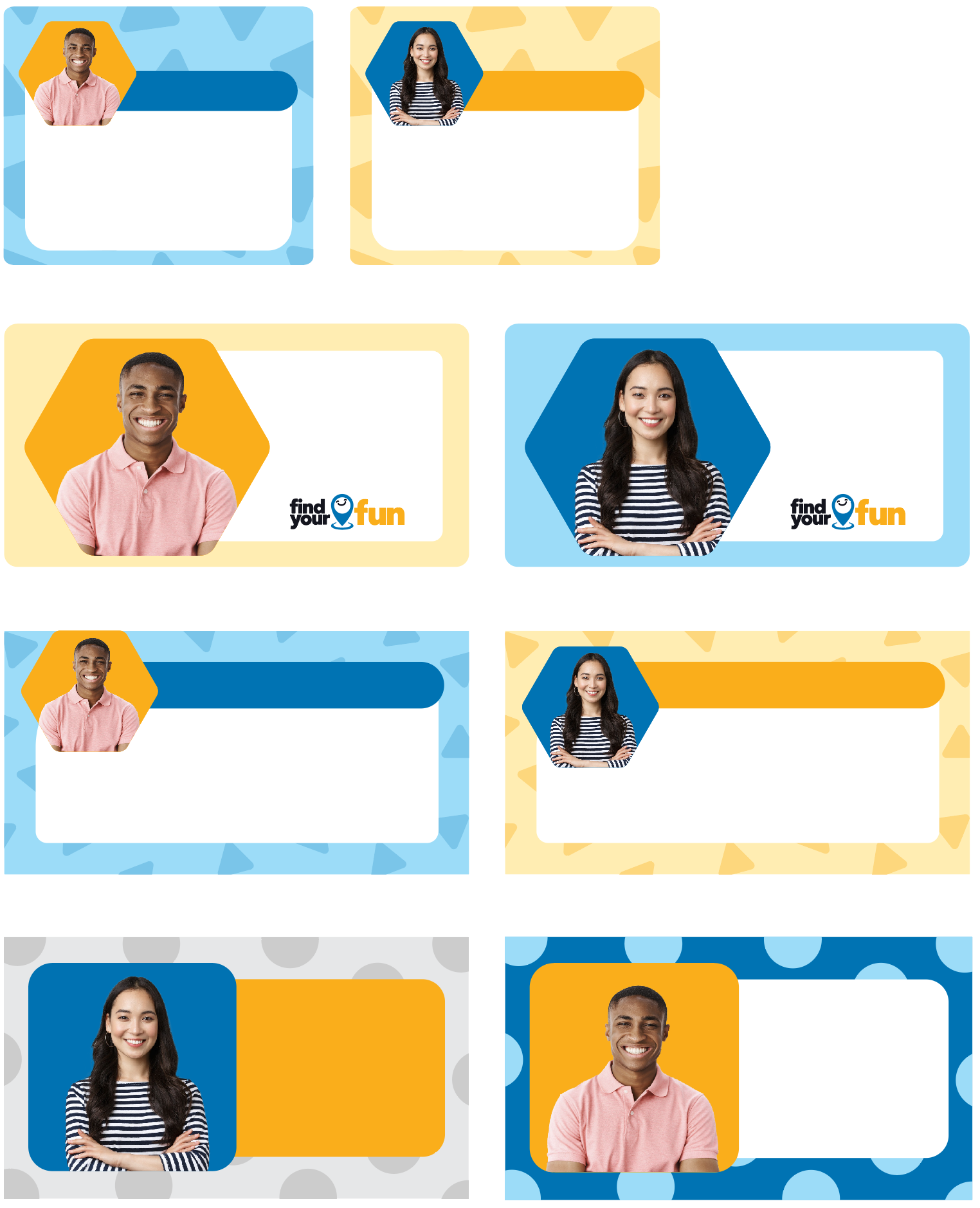
Employee post templates
Creative Concepts (Sketches)

Animations
Concept animation
For the logo animation, the same concept of pretending play was applied. The idea for the default logo animation was to use simple shapes (to connect to the educational goal of the studio). In this case, the symbol turns to three different shapes (the ones that young children recognize the most), and those shapes would interact to each other (to resemble to a group of children playing) and then it goes back to the initial stage of the logo.
UI Design


Interaction Icon
Trying to connect the business goals with the targeted users of the studio, my idea for the logo and its application on the website, ads and other marketing pieces (such as social media templates) was to create something unique, simple, fun and that would engage not only the kids, but their parents.
The concepts that I came up with used the logo symbol as a “transformer”, which would turn to anything, resembling the imaginative play and adapting it to the business needs (it would change every time that a new launch needed to be promoted).
Adding to this concept, is the idea of finding the fun (linking the idea to the studio’s name), using the magnifying glass to find whimsical assets hidden in the logo symbol (colours or characters).


Concept animation
Final animation created in After Effects.
Play Icon
Before designing all the UI icons for the studio to be used in all the games settings and website, I created a grid (inspired by Fibonacci's ratio) to be used as a formula for consistency and to support implementation.

Moving Forward Icon

Pause Icon

Volume Icon


Part of the documentation to support the development team work.